ShopDreamUp AI ArtDreamUp

Deviation Actions


Suggested Deviants


Suggested Collections


You Might Like…


Featured in Groups

Description
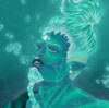
Ahhhhh these two are so satisfying. I worked v hard on this, like jesus.
So yeah this is Zuba, and his little sister Khari. They're RWBY characters for a friend from South Africa. I'll be uploading more human (Or ya know just RWBY) art in general because I want to do better with my anatomy. I definitely want to start doing so interactions with him and my RWBY characters as well. I still need to submit Lu, the last member of LLAC.
Short Description:
Zuba and Khari grew up in a small fishing village in Vacuo. Both born with the marks of the spirit snakes, their hereditary semblances are also interconnected. With Zuba having the ability to expel large amounts energy that allow him to control things with it, and Khari able to channel energy through her body, to rejuvenate aura, and give away energy to others (Namely her brother).
Zuba and Khari can exchange energy between them, and exchange aura to strengthen one while simultaneously making the other one weaker.
This is them playing super speed tag, as they are both extremely fast like snakes. They're adoooorable bro and sis. <333
Image size
2000x2200px 3.33 MB
© 2016 - 2024 Grump-Support
Comments7
Join the community to add your comment. Already a deviant? Log In
I like this scene, it conveys the friendship between the two characters in a fun, playful manner!
Your grasp of depicting motion far outweighs my own. The subtle blurring and the 'energy lines' allow the view to look at this as though it is a frozen moment in time.
I also really like the colour schemes you have chosen for the characters, they are bright and attention getting without being overly 'vivid' or unnatural looking (Green would be a difficult pigment to make naturally and long-lasting in a desert environment - But it still works here).
On the negative side, the shading, while present and technically accurate, is a little under-done in my opinion, especially when comparing the characters and their background.
Speaking of which, the buildings seem dis-proportionately small compared to the characters as it stands. You either need to shade and/or blur them more to enhance the 'depth of vision', making them appear further away, or make them larger so that their size is more in-line with how close they appear.
~JD